Exit intent modals
An exit intent modal opens when a shopper looks like they are about to leave the page. You build it in the Visual Builder, and it needs no JavaScript.
How exit intent is detected
The signal differs by device:
- Desktop: the mouse crosses the top edge of the viewport, which usually means the shopper is heading for the address bar or a browser tab.
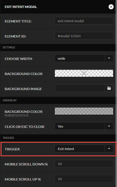
- Mobile: the shopper scrolls down roughly 50 percent, far enough that the address bar hides, then scrolls back up about 10 percent to bring it back.
Add the modal
-
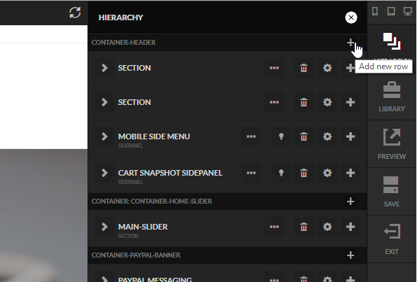
Open the hierarchy panel and select the plus icon under any container. The container does not matter; the header container is a common choice.
-
Search for
modaland select the Modal element.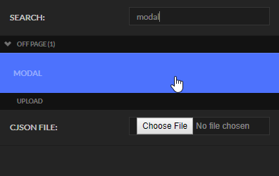
-
Double-click the element name in the hierarchy and rename it to something descriptive, such as
Exit Intent Modal. Select the lightbulb icon to open the modal on the page.
Design the content
Add whatever content the modal should hold, and style it as you would any other element. For example, adding a row with a headline, setting a border with rounded corners, and setting an underlay color produces this:
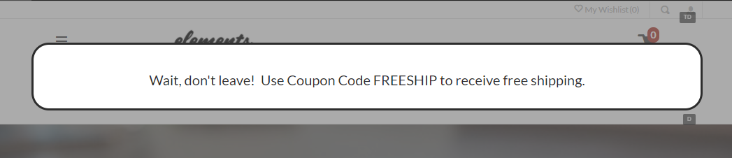
What goes inside depends on your business. Some merchants offer a coupon, others ask for a mailing list signup before the shopper leaves. The modal's animation settings control how it enters, which is worth setting rather than letting it appear instantly.
Set the trigger
Set the modal's Trigger to Exit Intent. The scroll percentage used for the mobile detection is adjustable on the same panel.
That is the whole setup. The modal now opens on exit intent without any custom code.