Mega Menu
Overview
A Mega Menu is a Visual Builder element for header dropdowns that need more room than a standard Menu. A Menu element's items open a simple list of links, but a Mega Menu item's content area can hold anything you can build in Visual Builder: columns of links, images, video, or custom HTML. That content area displays when a visitor hovers over the top-level item.
Mega Menu is two elements working together:
- Mega Menu: the container for the menubar itself and its settings, such as colors and which devices it appears on.
- Mega Menu Item: one top-level entry in the menubar, for example "Catalog." Each item has its own content area that you fill in separately.
Add a Mega Menu element
- Open your StoreFront in the Visual Editor.
- Click Add Element on a structural element already in your header, such as a Flex Box, Panel, or Row. Mega Menu can't be added directly to the header section itself, it needs a container element to sit inside.
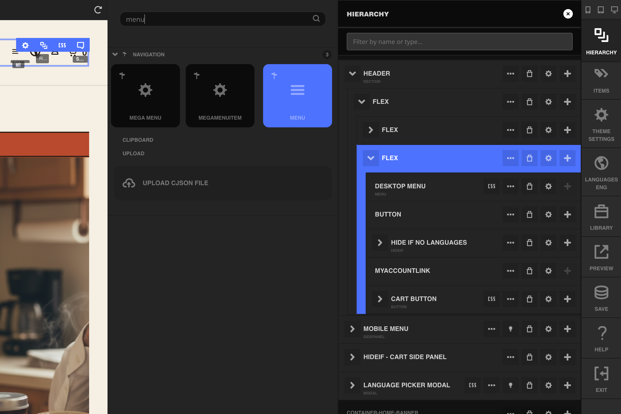
- Search for "menu" and select the Mega Menu element to insert it.
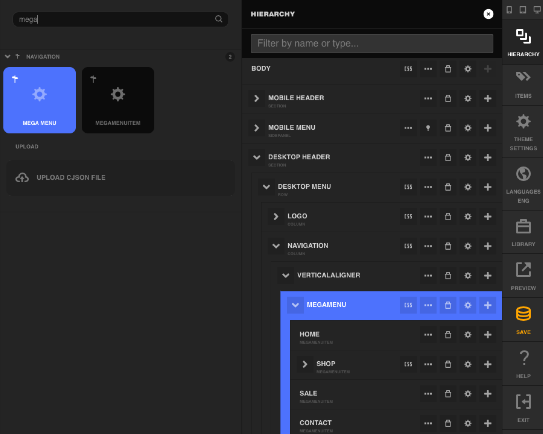
- Select the new Mega Menu element, click Add Element again, search for "mega," and select Mega Menu Item to add one nested inside it. Repeat for each top-level entry you want in the menubar, for example Home, Shop, Sale, and Contact.
Configure the Mega Menu element's settings
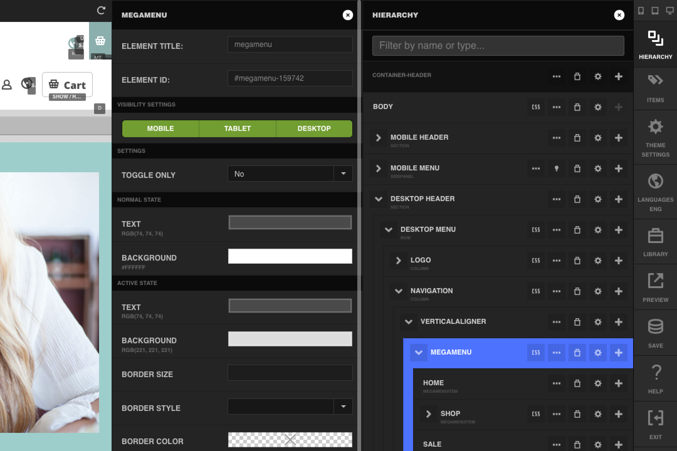
Select the Mega Menu element and open its settings panel.
| Setting | Description |
|---|---|
| Element Title | Internal label for the element, shown in the hierarchy tree. |
| Element ID | Read-only ID Visual Builder assigns to the element. |
| Visibility Settings | Show or hide the menubar per device: Mobile, Tablet, Desktop. |
| Toggle Only | When set to Yes, a top-level item's content area opens only when a visitor clicks the item, not on hover. Pair this with an empty Link on that Mega Menu Item, described below, so the click opens the content area instead of navigating to a page. |
| Normal State: Text, Background | Color of a top-level item's text and background while its content area is closed. |
| Active State: Text, Background, Border Size, Border Style, Border Color | Color and border of a top-level item's text and background while its content area is open. |
Configure a Mega Menu Item
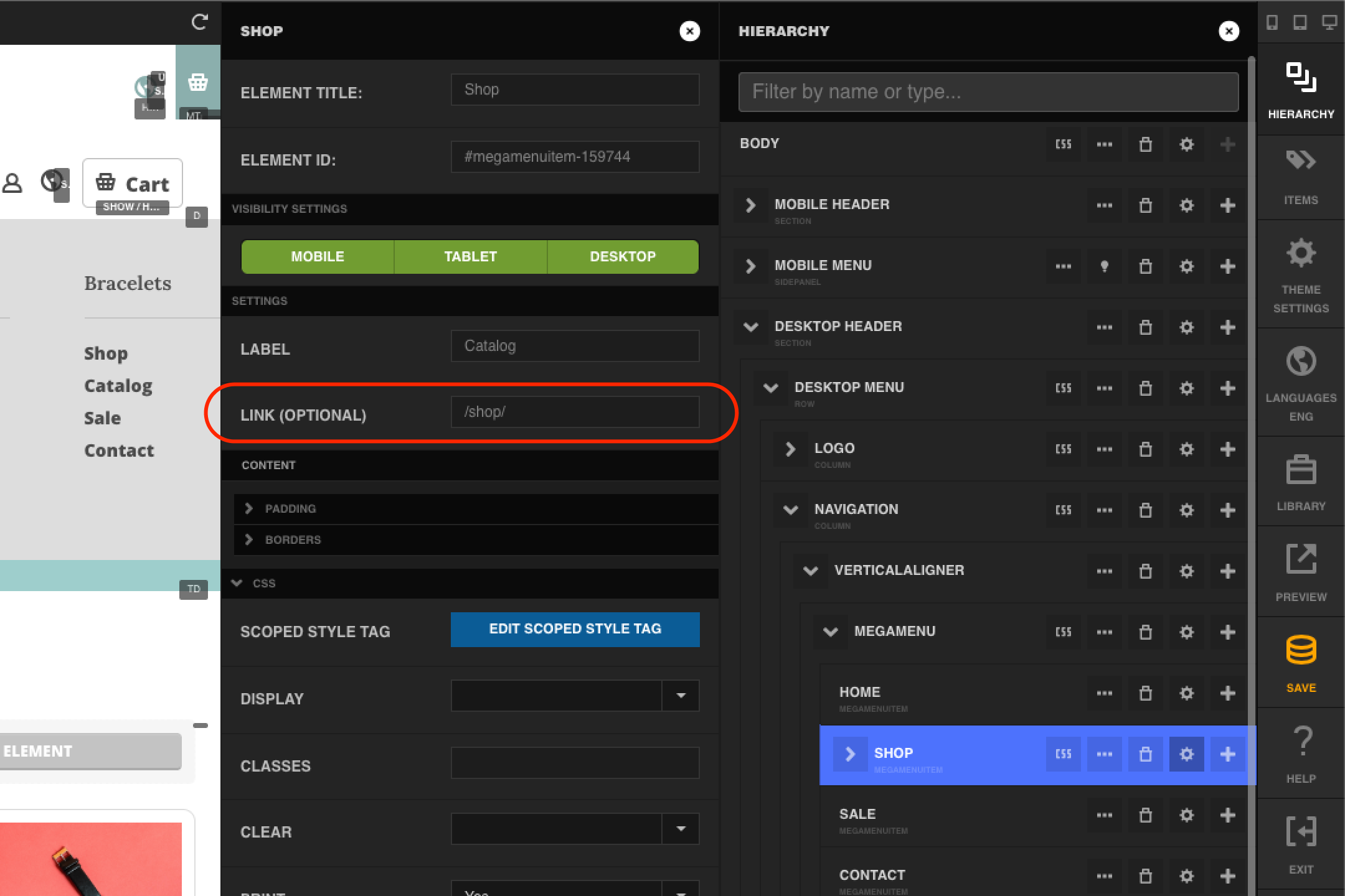
Select a Mega Menu Item and open its settings panel to set its label and, optionally, a link.
| Setting | Description |
|---|---|
| Element Title | Internal label for the element, shown in the hierarchy tree. |
| Element ID | Read-only ID Visual Builder assigns to the element. |
| Visibility Settings | Show or hide this item per device: Mobile, Tablet, Desktop. |
| Label | The text a visitor sees in the menubar, for example "Shop." |
| Link (Optional) | The page a visitor goes to if they click the item without opening its content area. Leave this empty if the item's Mega Menu has Toggle Only set to Yes, so a click always opens the content area instead of navigating away. |
Build a menu item's content
Each Mega Menu Item's content area is empty until you add elements to it. A common pattern is a Row split into Columns, with each column holding a Headline and a Menu element set to Vertical Accordion:
- Select the Mega Menu Item you want to build out.
- Add a Row element inside its content area, then add Column elements inside the row, one per group of links.
- In each column, add a Headline for the group's title, then add a Menu element below it and set its Menu Type to Vertical Accordion.
- Fill in each Menu element's content the same way you would for any StoreFront menu.
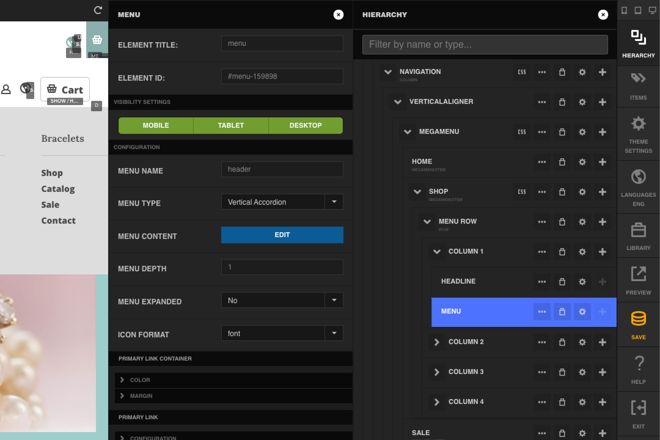
You aren't limited to columns of links. A Mega Menu Item's content area is a normal Visual Builder container, so you can add any element to it, including images, videos, or a Custom HTML element for content the built-in elements don't cover.
Leave a Mega Menu Item's content area empty for a plain link with no dropdown, such as "Home" or "Contact" in a header that otherwise uses Mega Menu for the items with more content.