The hierarchy view is accessed from the menu as shown below.
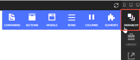
When you click on the Hierarchy button another side panel will open with the view. The hierarchy view organizes the page structure and elements into a sequential nested list view for easy editing.
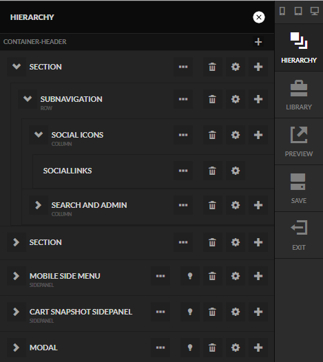
As you can see in the screenshot above, the hierarchy of a page typically follows this order:
- Container
- Section
- Row
- Column
- Element
- Column
- Row
- Section
Let's break down each of these fundamental building block elements.
Containers - the outermost element on a page. A page is typically composed of multiple containers such as the header, footer, body containers, etc.
You'll want to create new containers for sections that you plan on reusing in other areas of your theme, otherwise, simply adding new sections for additional elements will be sufficient. (For those familiar with the older storefront themes, this is akin to adding new snippet templates.)
Section - within each container there are one or more sections. A section is a logical grouping of child elements. For example a header container may contain two different sections for a mobile menu bar and a desktop menu bar.
Row - within each section you enter the grid layout. StoreFront utilizes a 12 column wide grid made up of rows and columns. A row takes up the full width of the parent element.
Column - within a row, there can be 1 or more columns. Each column takes up a set amount of width on the page. For example if we have a row with two columns that are 6 wide each then each column will take up 50% of the space. By nesting rows and columns you can achieve almost any layout imaginable.
Elements - Any other type of element that can be on the page such as a menu, slider, image, etc. Some element types, such as tabs, can contain other elements underneath them. The amount of nesting that is possible is limited only by the types of elements that you combine.
Understanding the Icons on the Hierarchy View
When you hover over an element it will highlight in blue.
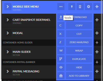
The following tools are available.
| Icon | Description |
|---|---|
 | Delete this element (and all children) from the hierarchy |
 | Edit the settings for this element. |
 | Add a child element (only visible if the element supports children) |
 | Open/Close (only shown for Modals and Side-panels) |
 | Hover over this to display a drop down menu of more advanced tools listed below. |
 | Download the element hierarchy from this point as a CJSON file. This can be saved off and used later. |
 | Copy the element onto the clipboard. |
 | Cut the element out and place on the clipboard. |
 | Zero out the margin and padding for the element (and optionally a certain amount of levels lower) |
 | Wrap a new parent element around this element. Useful if you forgot to place a link around an image for example. |
 | Duplicate the entire element and children. |
 | Hide this element. The element will not show when the page loads until something, like a button, triggers the element to show. |
 | Add the element to the library. This allows you to save off groups of elements into a reusable building block. |