Introduction
This tutorial uses the Elements theme, so certain aspects may differ when using a different storefront theme.
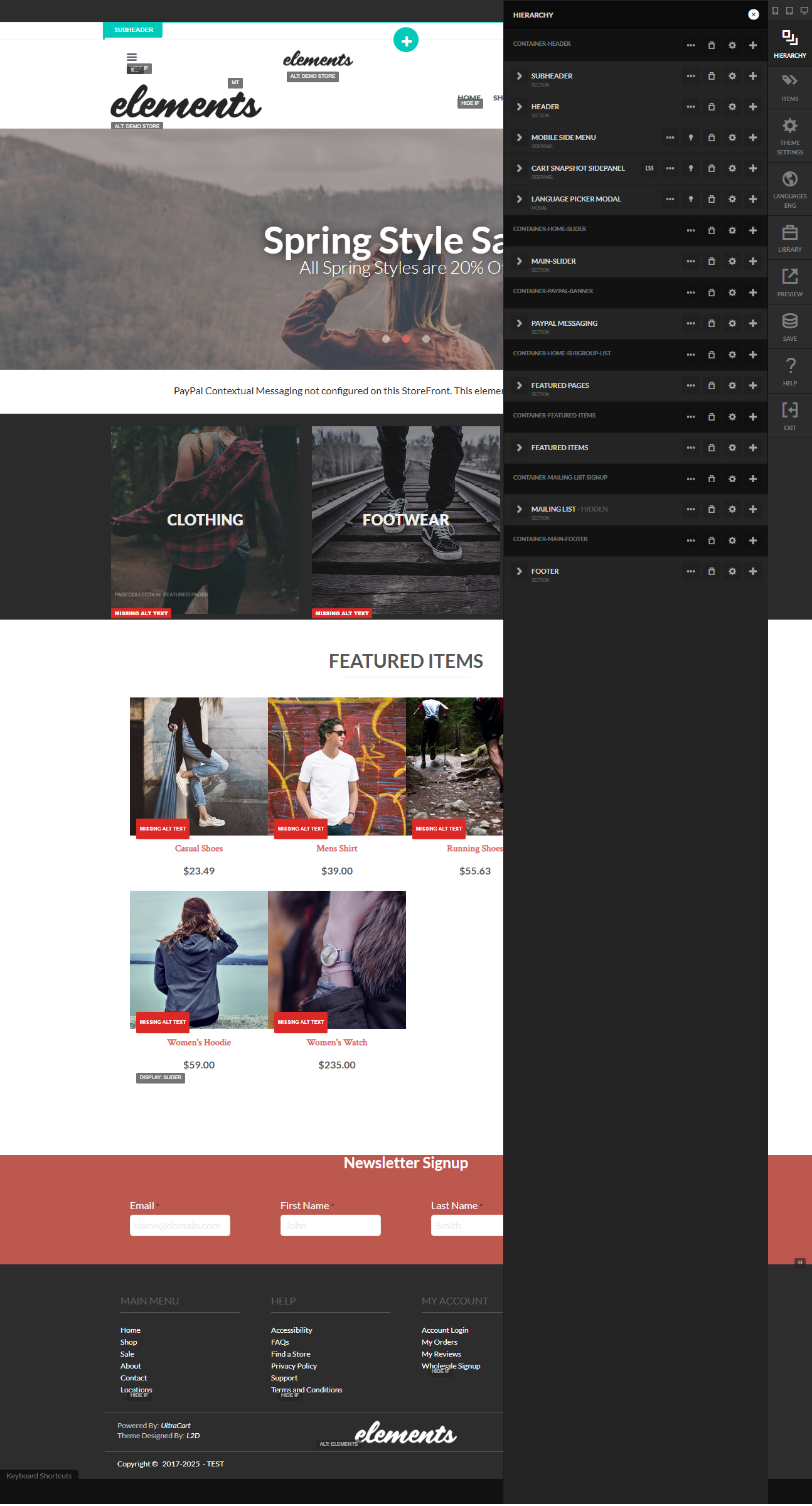
View of Hierarchy Panel in the Storefront Visual Builder
Prerequisites
Must have user permissions to access and modify storefronts.
Default Hierarchy Snapshot for UltraCart Storefronts Elements Theme
The Hierarchy panel in the Visual Builder provides a tree-like view of the page structure, allowing you to navigate, reorder, and manage elements. Below is a snapshot of the default hierarchy for the Elements theme, based on the provided preview. This represents a typical homepage layout, with indentation indicating parent-child relationships. Elements are grouped into containers for organization.
-
Container Header (Main header container)
-
Subheader (Subheader section)
- Elements (Text element: "Elements")
-
-
Elements (Logo or branding image element)
-
Subheader (Banner subheader with promotional image)
-
Spring Style S (Text overlay on banner image)
-
All Spring Styles are 20% (Promotional text element)
-
-
Container Pay Message (Payment messaging container)
- PayPal Context Messaging not configured... (Text element with configuration notice)
-
Featured Items (Section header for featured category images)
-
Clothing (Image/text element for clothing category)
-
Footwear (Image/text element for footwear category)
-
-
Featured Items (Product showcase container)
-
Casual Shoes (Product card: $23.49)
-
Men's T-Shirt (Product card: $39.00)
-
Hiking Boots (Product card: $55.69)
-
Women's Hoodie (Product card: $59.00)
-
Wrist Watch (Product card: $25.00)
-
-
Newsletter Signup (Signup form container)
-
Container Footer (Main footer container)
-
Footer (Footer text or divider)
-
Main Menu (Navigation menu: Shop, About, Locations)
-
Help (Help links: FAQ, Privacy Policy, Terms & Conditions)
-
Login (Login link)
-
My Account (Account links: My Orders, Wholesale Signup)
-
This structure emphasizes a clean, modular layout typical of the Elements theme, with responsive containers for headers, promotional banners, product grids, and footers.
Actions Menu Icons in the Hierarchy Panel
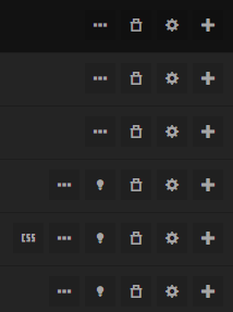
The Hierarchy panel includes inline action icons next to each element or container for quick interactions. These appear as small buttons (e.g., drag handles, toggles) and a more actions menu (typically a three-dot ellipsis). Containers often show additional options like "add child." Below is a table describing the common icons and their functions, based on standard Visual Builder behavior in the Elements theme.
| Section | Breakpoint | Explanation |
|---|---|---|
| ALL | Applies to all screen sizes (no media query) | This section allows you to define base CSS styles that are scoped to the selected element and its children, applying universally across all devices and screen widths. Use it for fundamental styling like colors, fonts, or layouts that don't need to change responsively, ensuring the element's core appearance is consistent while isolating these rules from the global theme to prevent unintended side effects on other parts of the page. |
| SMALL-ONLY | < 640px | Ideal for mobile-specific adjustments, this section scopes CSS within a media query targeting small screens only (e.g., smartphones in portrait mode). You might use it to implement compact layouts, reduce font sizes, or hide non-essential child elements, ensuring the selected element adapts efficiently to limited space without affecting larger views. The scoping keeps these mobile tweaks isolated to the element, avoiding conflicts with desktop styles. |
| MEDIUM-ONLY | > 640px and < 1024px | This targets tablet-sized screens exclusively, allowing scoped CSS for intermediate devices (e.g., tablets or small laptops). It could be used to fine-tune element spacing, adjust image sizes within the element, or modify grid columns for better readability on medium widths, while the scoping ensures these changes don't leak to smaller or larger breakpoints, maintaining a tailored responsive experience. |
| MEDIUM-UP | > 640px | For styles that apply to medium and larger screens (e.g., tablets, desktops), this section scopes CSS to enhance the element on wider views, such as increasing padding, enabling multi-column layouts, or positioning elements absolutely. It's useful for progressive enhancements where the base (ALL) styles are overridden for non-mobile devices, with scoping preventing global interference and focusing changes on the edited element. |
| LARGE-UP | > 1024px | Targeting desktop and larger screens, this scopes CSS for expansive views (e.g., standard monitors). You might use it to implement wider margins, larger typography, or complex hover effects on the element's children, optimizing for user interactions on bigger displays. Scoping ensures these enhancements are contained, allowing precise control without altering smaller breakpoint behaviors. |
| XLARGE-UP | > 1200px | This section is for extra-large screens (e.g., wide monitors or high-resolution displays), scoping CSS to refine the element further, such as maximizing content width, adding subtle animations, or adjusting z-index for layered components. It's particularly helpful for luxury or detail-oriented designs, with the media query and scoping isolating these upscale tweaks to avoid bloat on smaller devices. |
| XXLARGE-UP | > 1440px | Aimed at ultra-wide or 4K+ screens, this scopes CSS for the largest views, enabling maximum utilization of space—like full-width backgrounds or intricate sub-element arrangements within the selected element. Use it for high-end responsive features, ensuring the scoping limits the impact to this breakpoint and prevents performance issues on mobile by not loading unnecessary rules universally. |
ThreeDots Menu
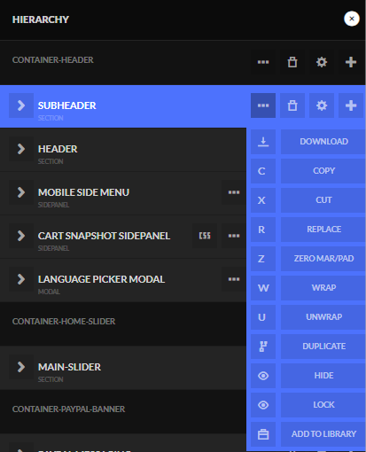
| Menu Item | Icon | Description |
|---|---|---|
| Download | ↓ | Downloads the selected element or its configuration as a file for backup or sharing. |
| Copy | C | Copies the selected element to the clipboard for pasting elsewhere in the hierarchy or page. |
| Cut | ✂ | Cuts (removes and copies) the selected element to the clipboard, allowing it to be pasted in a new location. |
| Replace | R | Replaces the current element with another from the library or a similar type, preserving some properties. |
| Zero Pad | Z | Resets padding to zero on the selected element, removing any custom spacing adjustments. |
| Wrap | W | Wraps the selected element in a new container, such as a div or section, for grouping or styling purposes. |
| Unwrap | U | Removes the wrapping container around the selected element, promoting it to the parent level. |
| Duplicate | ⟐ | Creates an exact copy of the selected element and places it immediately below in the hierarchy. |
| Hide | 👁 (slashed) | Hides the selected element from the live preview without deleting it from the hierarchy. |
| Lock | 🔒 | Locks the selected element to prevent accidental edits or movement during further design work. |
| Add to Library | 📚 | Saves the selected element as a reusable component in the theme's library for future pages. |
Lightbulb

The 'lightbulb' icon (💡) in the Hierarchy panel serves as a toggle to view a modal within the Visual Builder.
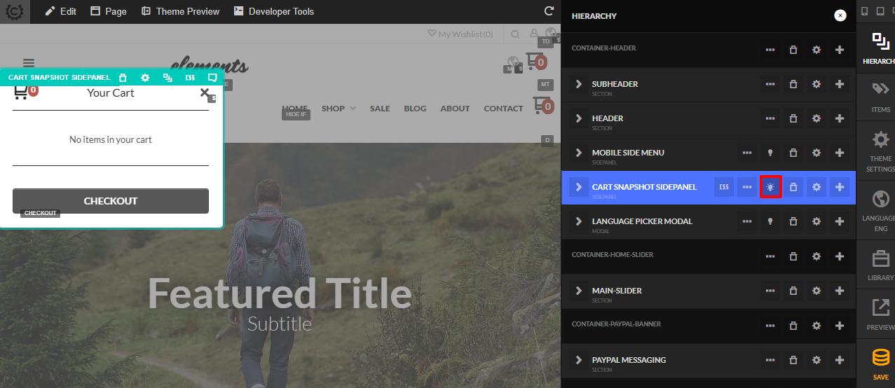
In the second image, the 'lightbulb' icon appears 'lit,' indicating that the modal—specifically the "Cart Snapshot SidePanel"—is currently open and visible in the Visual Builder view. This toggle allows you to preview and interact with pop-up modals, lightboxes, and other overlay elements directly within the editing interface.
This feature is particularly helpful for inspecting and refining the appearance and functionality of pop-up modals and lightboxes. It enables you to ensure that these elements display correctly, including their positioning, content layout, and responsiveness across different screen sizes. By toggling the modal on and off, you can verify that it aligns with the design intent, check for any overlap issues with underlying content, and confirm that interactive elements (like the "CHECKOUT" button in the cart modal) are accessible and properly styled, enhancing the overall user experience during the design process.
Settings
The Settings panel for the selected element, enabling detailed configuration like layout, styling, or behavior adjustments.
note
The Settings panel will contain element specific settings, so the contents of the settings panel will vary according to the element that is being edited.
The Settings panel will contain element specific settings, so the contents of the settings panel will vary according to the element that is being edited.